



Taboola Creative: Headlines & Thumbnails That Click
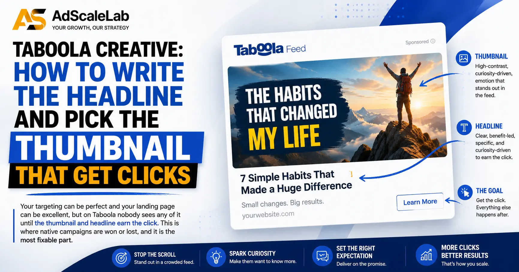
Here is the thing nobody tells you when you start on Taboola Creative. Your targeting can be perfect. Your landing page can be excellent. Your offer can be genuinely good. And none of it matters until two small things earn the click: the thumbnail and the headline.
On native, that pairing is the whole ballgame. It is the only part of your campaign a user sees before they decide. If it does not earn attention in a feed full of real articles, everything downstream is irrelevant because nobody gets there. The good news is that this is also the most controllable and most fixable part of the whole campaign. So it is worth getting right.
This is a plain guide to Taboola creative for people who have never run native before.
Why Taboola Creative is its own skill
On social, people expect ads. On search, people are actively looking for something. Native is different. Your ad appears in a recommendation widget at the bottom or middle of an article the person is already reading, usually labelled something like "Recommended for you" or "From around the web." They are not looking for you. They are exploring content.
That single fact shapes everything. Your creative has to feel like it belongs next to editorial content, not like it interrupted it. An ad that screams "ad" gets ignored. An ad that reads like an interesting story gets the click. This is why creative built for Facebook often flops when pasted straight onto Taboola, and why native has its own rules.
The thumbnail: what actually works
The image does most of the heavy lifting. In a feed, the picture is what stops the scroll before anyone reads a word. Taboola's own creative guidance is consistent on what tends to work, and it lines up with what experienced native buyers see.
Use real, authentic images, not polished stock. This is the one that surprises newcomers most. Overly polished, obviously-staged stock photography underperforms. Authentic, slightly unpolished, real-looking images win, because they blend into the editorial environment instead of looking like an ad. Taboola's guidance explicitly favours authentic, unpolished visuals with a clear focal point.
Faces work. People are drawn to faces, and Taboola calls the presence of faces one of the single most powerful features for driving engagement. Use images with a real person, ideally your target audience, framed from the shoulders up, and test different expressions. There is even published guidance that genuine smiles and candid, non-studio shots tend to outperform neutral, professional-looking ones. Faces perform best as standalone visuals rather than crowded scenes.
If you sell a product, show the product. Including the actual product in the image helps qualify the click, so the people who tap through already have some intent. That means fewer wasted clicks and better downstream numbers.
Do not bake in logos or text. This one is practical. Taboola crops thumbnails to different sizes for different placements, and a logo or overlaid text can end up off-centre or cut off. Keep the image clean and let the headline carry the words.
Use colour to stand out, subtly. Eye-catching colour helps pull attention in a busy feed. If you have a recognisable brand colour, use it. Just avoid anything that reads as a flashing banner, which brings us to the line you should not cross.
Keep motion subtle if you use it. Motion ads can work, but too much movement looks like an intrusive banner and gets tuned out. Subtle motion draws the eye. Frantic motion repels it. And any motion ad has to make sense with no sound, because it will usually play silently.
The headline: read like an article, not an ad
Once the image stops the scroll, the headline closes the click. The core principle is simple: it should read like a compelling article title, not a line of ad copy.
Keep it short. Taboola recommends headlines in the region of 34 to 45 characters, with a hard ceiling around 60. Beyond that, publishers may truncate it, which can cut your message in half or trigger accidental clicks. Short, clear headlines get read and absorbed faster in a feed where you have a fraction of a second.
Use the curiosity gap, honestly. The most effective native headlines give the reader just enough to make them want the rest, an open loop the click closes. That is the curiosity gap, and used well it is the engine of native. Used badly, it becomes clickbait that overpromises and gets you a rejection or a bounce. The line is honesty. Tease genuine value, do not fake it.
Be specific and be relevant. Vague headlines lose to specific ones. Where it fits, speak to the actual reader: their situation, their interest, their region. A headline that feels tailored earns more engagement than a generic one. Editorial tone, a useful angle, a first-person feel, an expert framing, these all help it sit naturally beside real content.
Match the headline to the landing page. A headline that promises one thing and lands on another is the fastest way to burn money and fail review. The click means nothing if the visitor immediately bounces because the page is not what the headline sold. Consistency between ad and page is not just a compliance point, it is a performance one.
How many creatives to launch with
Do not launch one ad and hope. Native is a testing game, and you find winners by starting with a spread and letting the data narrow it down.
A widely recommended starting point is to combine a few images with several headlines: think two or three thumbnails and around five headlines, or a batch of roughly five to ten creative combinations in total. You are not trying to guess the winner up front. You are giving the system enough variety to find it for you. Pair curiosity-driven, non-promotional headlines with high-contrast, authentic images, and let them run.
Creative fatigue is real, so plan to refresh
Even a winning creative wears out. As the same audience sees the same ad repeatedly, engagement drops. This is ad fatigue, and it will pull your CTR and conversion rate down over time even if nothing about your targeting changed. It is not a mistake you made, it is a normal lifecycle.
The answer is a pipeline, not a one-off. Keep a steady supply of new creative coming, test systematically rather than sporadically, and always have the next batch ready before the current one tires. Taboola's own guidance points to short test windows, in the region of 48 to 72 hours, to see whether a new creative is beating your current one on impressions and CTR. Test consistently, keep the winners, retire the tired ones, feed in fresh variations.
How to read CTR without fooling yourself
CTR, click-through rate, is the first number you will watch, and it is a good early signal that your headline, image and targeting are working together. As a rough orientation, published figures put typical Taboola CTR somewhere in the region of 0.25% to 1%, varying a lot by vertical, but treat that as a loose reference and not a target, because your own baseline is what matters.
Two cautions, because CTR is easy to misread. First, a high CTR on a misleading creative is worthless, it just means you tricked people into a click they regret, and they bounce. CTR only matters alongside what happens after the click. Second, give a creative enough impressions before you judge it. Killing an ad on an hour of data is guessing. Let it gather a fair sample, then decide.
Test one thing at a time
When something is not working, change one variable, not five. If you swap the image, the headline and the audience all at once and results improve, you have learned nothing about why, and you cannot repeat it. Since the image usually drives the biggest swing in native, that is often the first thing to test. Change it, hold everything else steady, and see what the number does. Then move to headlines. Systematic beats scattershot every time.
The short version
On Taboola, the thumbnail stops the scroll and the headline closes the click, and together they decide whether anyone ever sees your offer. Use authentic images over polished stock, lean on faces, keep headlines short and genuinely curious without lying, launch with a spread of combinations, and refresh before they tire. None of this is guesswork. It is the most controllable part of the whole campaign, which is exactly why it rewards the effort.
Everything here assumes you already have a live account to run on. If you do not yet, a Taboola agency account gets you set up with your URL reviewed before you pay, standard pre-approval in about 30 minutes, and same-day USDT topups with the fee shown before you commit.
To go deeper on the rest: our complete Taboola agency account guide covers buying and running the account, what we see get landing pages rejected covers approval, and if the platform looks unfamiliar, How to Buy and Run Native Ads On Taboola explains the current setup.
FAQ
What matters more on Taboola, the image or the headline?
The image usually does the most work, because it is what stops the scroll in a feed before anyone reads. The headline then closes the click. You need both, but if you are testing one thing first, the thumbnail typically moves performance most.
Why do stock photos perform badly on Taboola?
Overly polished, obviously-staged images look like ads, and native works by feeling like editorial content. Authentic, real-looking, slightly unpolished images blend into the environment and get more clicks. Taboola's own guidance favours authentic visuals over studio-perfect ones.
How long should a Taboola headline be?
Taboola recommends roughly 34 to 45 characters, with a ceiling around 60. Longer headlines risk being truncated by publishers, which can cut your message or cause accidental clicks.
How many creatives should I start with?
Rather than one ad, start with a spread. A common recommendation is two or three images with about five headlines, or roughly five to ten combinations, then let the data show you the winners.
How often should I refresh creative?
Before it tires, not after. Creative fatigue lowers CTR and conversions over time as audiences see the same ad repeatedly. Keep a pipeline of fresh creative and test new variations continuously, often in short windows of a couple of days.
What is a good CTR on Taboola?
Published figures put typical CTR somewhere around 0.25% to 1%, varying widely by vertical. Treat that as a loose reference, not a target. Your own baseline and, more importantly, what happens after the click matter more than hitting a benchmark.
Agency ad accounts, without the wait.
Buy and top up Google, Meta, native, and more from one dashboard.
Get started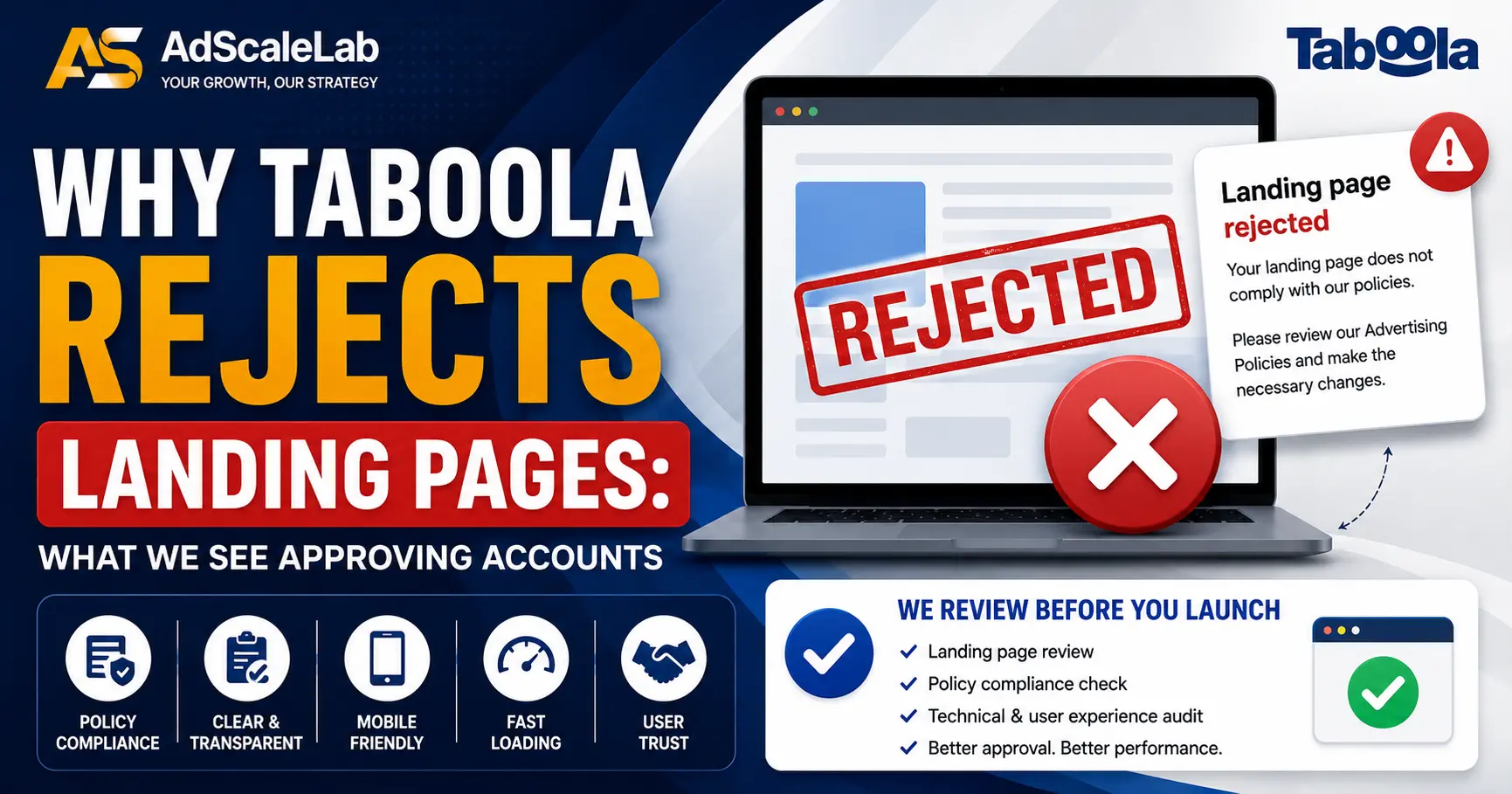
No comments yet. Be the first to comment.
Comments are open to registered AdScaleLab clients.
Sign in to comment