





How To Improve Taboola Advertorial Click-Through Rate
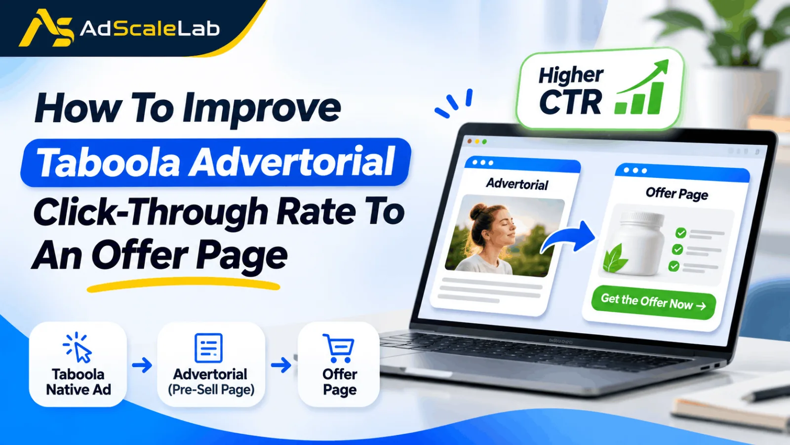
Improving your Taboola Advertorial Click-Through Rate is not just about getting people to click on an ad. It is also about convincing those visitors to take the next step after they arrive on your website. This is a challenge many native advertising advertisers face. A campaign may bring hundreds or even thousands of visitors to an advertorial, but only a small number of them actually click through to the offer page. You might have a good headline, an attractive image and a reasonable amount of traffic, yet visitors still leave without taking the next step.
In many cases, the problem is not the traffic itself. The advertorial may not be giving readers enough information, the product may not be explained properly, or the button leading to the offer page may be difficult to notice. Sometimes, visitors simply do not understand why they should continue. That is why improving the Taboola advertorial click-through rate deserves attention. Instead of focusing only on getting more visitors, advertisers should also look at what happens after those visitors land on the page.
In this guide, we will look at some practical ways to improve the number of people moving from a Taboola advertorial to an offer page, without making the page feel like one long advertisement.
What Does Advertorial-To-Offer Click-Through Rate Mean?
Before making changes to an advertorial, it is important to understand what you are measuring. The advertorial-to-offer click-through rate tells you how many people visit your advertorial and then click a link or button that takes them to the offer page. It is not the same as the CTR shown in your Taboola campaign report. That CTR measures clicks on the original advertisement, while this metric measures what visitors do after reaching your advertorial.
Let's take a simple example. Suppose your Taboola campaign brings 1,000 visitors to an advertorial. Out of those visitors, 120 click the button leading to the offer page. Your advertorial-to-offer click-through rate is 12%.
You can calculate it using this formula:
Advertorial-to-offer CTR = (Unique offer-page clicks ÷ Unique advertorial visitors) × 100
This number gives you a better idea of how well your advertorial is moving interested visitors towards the offer. However, there is no fixed CTR that every campaign should achieve. The result can change depending on the product, audience, content, offer and traffic source. The important thing is to track your own results and understand why visitors are clicking or leaving. Get Taboola ads agency account here

Ways To Improve The Taboola Advertorial Click-Through Rate
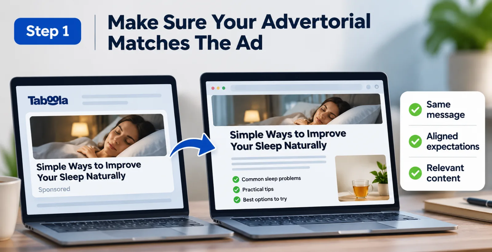
Step 1: Make Sure Your Advertorial Matches The Ad
Imagine someone sees a Taboola ad about ways to improve their sleep. They click because they want to learn more, but the advertorial immediately starts promoting a product without properly discussing the problem. There is a good chance that the visitor will leave. This happens when the message in the advertisement and the content on the landing page do not match.
When someone clicks your ad, they already have an expectation about what they are going to find. Your advertorial should continue that same conversation instead of suddenly changing the subject. For example, if the ad talks about a particular problem, start the advertorial by explaining that problem. If the ad promises a comparison, make sure the page actually includes useful information about the available options.
You should also avoid using the same advertorial for every campaign if the advertising angles are completely different. A page written for one audience may not connect with another audience. Keeping the message consistent from the ad to the advertorial makes the experience feel more natural and gives visitors a reason to continue reading.
Step 2: Don't Make The Introduction Too Promotional
The first few paragraphs can decide whether someone stays on your advertorial or closes the page. If the introduction immediately starts selling the product, readers may feel that the article is only trying to push an offer. Instead, begin with something that connects with the reason they clicked your ad.
Let's say you are promoting a product related to home water filtration. Rather than immediately talking about the product's price and features, you could start by explaining common concerns about water quality and what people should consider when choosing a filtration system. Once readers understand the subject, you can introduce the product naturally as one possible solution.
There is no need to make the introduction unnecessarily long. Give readers a clear idea of what the article is about and what they can expect to learn. Avoid exaggerated claims and headlines that promise results the page cannot support. A useful advertorial should give people a reason to keep reading, not make them feel that they have landed on a sales page by mistake.

Step 3: Explain Why The Product Is Worth Exploring
One mistake advertisers sometimes make is discussing a problem throughout the advertorial and then suddenly showing a button asking readers to visit the offer page. The missing part is the explanation of how the product relates to the problem. Visitors should understand what they are being asked to explore before they click.
If you are promoting a software product, explain what it does, who might find it useful and which problems it is designed to solve. If it is a physical product, discuss its relevant features and how it may help the intended customer. You do not have to explain every small detail. The offer page can provide additional information about pricing, plans, specifications or purchasing conditions. But the advertorial should provide enough information for readers to understand why the next page may be useful to them.
Think about the questions someone might have before considering the product. Answer the most important ones in the article. When the offer is introduced after a proper explanation, clicking through feels like the next logical step rather than an unexpected sales pitch.

Step 4: Give Your CTA Button A Clear Message
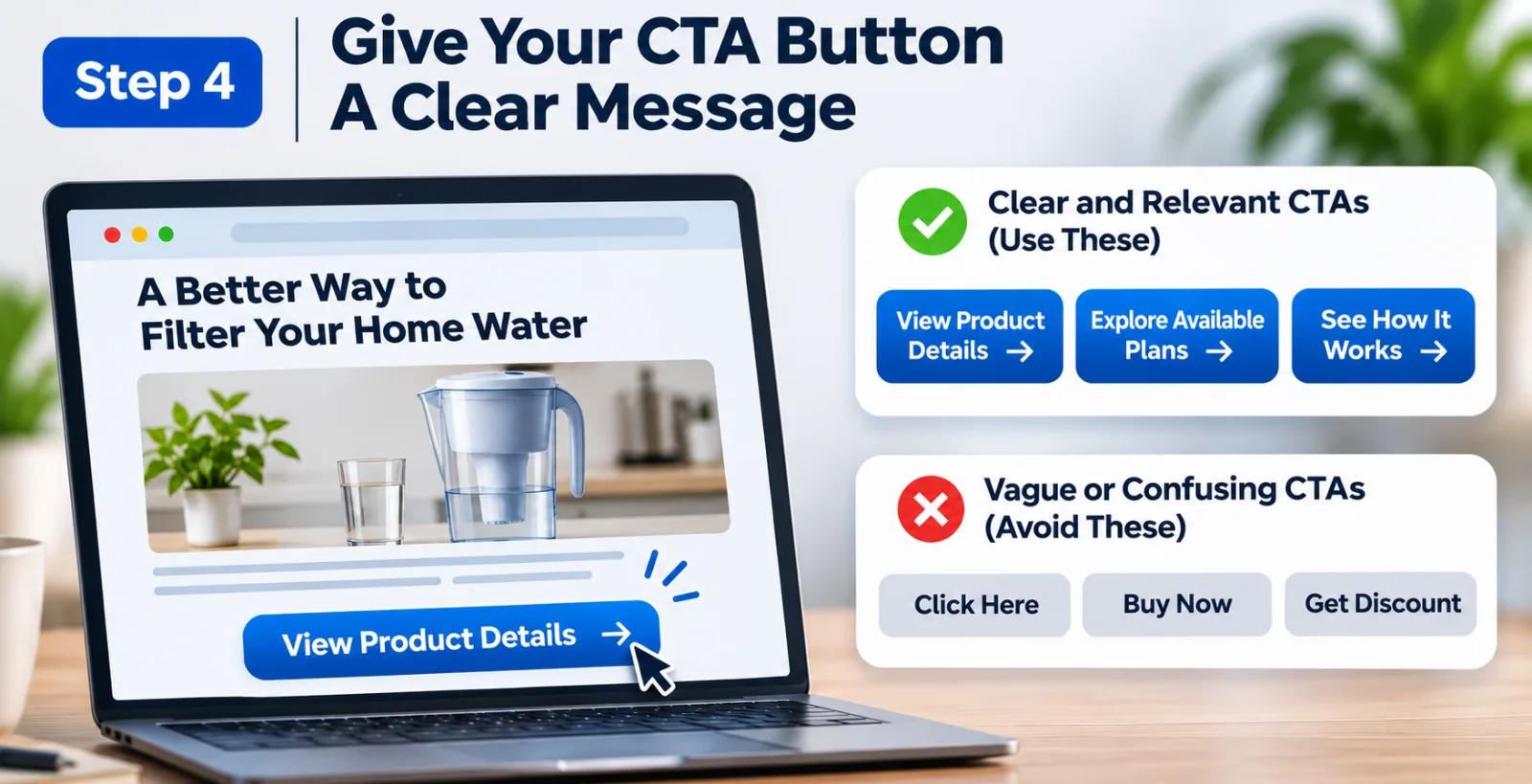
The call-to-action button is the link between your advertorial and the offer page. If visitors cannot understand what happens after clicking it, they may simply ignore it. For example, a button that says "Click Here" does not give much information. Depending on the offer, something like "View Product Details", "Explore Available Plans" or "See How It Works" may explain the next action more clearly.
The wording should always match the actual destination. Do not promise a free trial, discount or special deal if the offer page does not provide it. Also, avoid using too many different CTA messages on the same page. If one button says "Buy Now", another says "Learn More" and a third promises a discount, visitors may not know which one to choose.
Keep the main action simple. You can test two different CTA messages to see which one brings more visitors to the offer page, but make sure the wording is honest and relevant to the product.
Step 5: Put The CTA In A Place Where Readers Can Find It
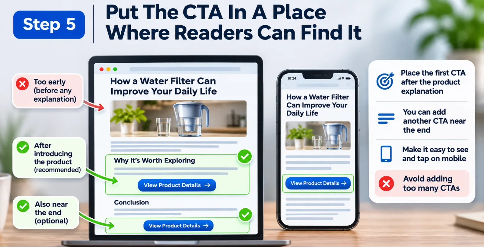
Even a well-written CTA may not get clicks if visitors cannot find it. Some advertisers place a button immediately below the headline, before the reader has learned anything about the product. Others put the only button at the very bottom of a long advertorial. Neither approach is guaranteed to work.
A practical starting point is to place the first CTA after the article has introduced the product and explained why it may be useful. At that stage, interested readers have enough information to decide whether they want to explore further. You can also test another CTA near the end of the advertorial. Some visitors prefer to read the full explanation before opening the offer page, so giving them another opportunity can be useful.
Pay attention to how the page looks on mobile as well. The button should be easy to see and tap, with enough space around it. Avoid placing it between elements that make it difficult to understand which part of the page is clickable. Most importantly, do not add buttons everywhere just to increase the number of clicks. A few well-placed CTAs can be more useful than a page filled with promotional messages.
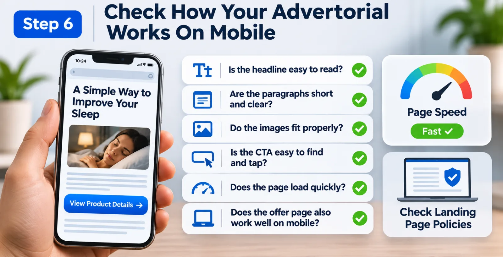
Step 6: Check How Your Advertorial Works On Mobile
A visitor might be interested in your product but leave because the page is difficult to use on their phone. This is something advertisers should check before making major changes to their campaigns. Open your advertorial on a mobile device and read it as an ordinary visitor would. Is the headline easy to read? Are the paragraphs too long? Do the images fit properly? Can you find the CTA without searching through the entire page?
Small problems can make the experience frustrating. A button that is too small, text that runs too close to the edge of the screen or a pop-up that covers the content can discourage visitors from continuing. Page loading speed is another thing worth checking. Large images, unnecessary scripts and too many page elements can make an advertorial slower to open. Compress images and remove features that do not add much value.
Do not forget to check the offer page too. There is little benefit in improving the advertorial if the next page takes too long to load or does not work properly on mobile. You should also review Taboola's official landing page policies before sending traffic to your page. The destination should provide a suitable and transparent experience for visitors.
Step 7: Build Trust Instead Of Making Bigger Promises
People are careful about clicking through to an offer when a page looks misleading. If your advertorial makes unrealistic claims or looks like an ordinary news article while secretly promoting a product, visitors may lose trust. Be clear about the purpose of the content. If the page is promotional, use suitable disclosures rather than presenting it as independent editorial coverage. Do not create fake customer reviews or testimonials, and do not use product claims that you cannot support.
For example, if you are promoting a product that claims to help with a particular problem, explain what the product actually offers. Avoid promising guaranteed results, especially when individual experiences can vary.
The Federal Trade Commission explains these expectations in its guide, Native Advertising: A Guide for Businesses. It discusses why advertising should not mislead people about the commercial nature of content and why disclosures need to be clear and noticeable. This is important because the goal should not be to get someone to click through without understanding the offer. You want visitors who are genuinely interested in what they will find on the next page.

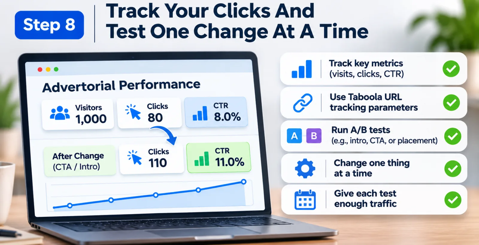
Step 8: Track Your Clicks And Test One Change At A Time
You cannot improve something properly if you do not know how it is performing. This is why tracking should be part of your advertorial optimization process. Start by measuring how many people visit the advertorial and how many click the main CTA. You can use an analytics event to record these clicks and compare them with the number of visitors.
For example, if 1,000 people visit your advertorial but only 80 click through to the offer page, your rate is 8%. After changing the introduction or CTA placement, you might find that 110 people click through from a similar number of visitors. That would be an improvement worth investigating.
However, make sure your tracking is set up correctly. If the same visitor clicks a button several times, your total click count may be higher than the number of unique visitors who actually moved to the offer page. Use consistent measurement rules and check that the tracking event fires only when the intended action happens. Taboola provides URL tracking parameters that can help advertisers identify information such as campaign, publisher, creative and device. You can read its official documentation on URL parameters for tracking. Its conversion tracking overview also explains the available approaches to measuring conversions.
Once your tracking is working, start testing. You could compare two introductions, different CTA wording or two button positions. Try not to change everything at once. If you change the headline, page layout, CTA and product explanation together, it becomes difficult to know which change actually helped. Give each version enough traffic to make the comparison meaningful. A difference based on only a handful of visitors may not tell you much.
Don't Judge Your Advertorial Only By Its Click-Through Rate
Getting more people to click from the advertorial to the offer page is useful, but it does not automatically mean your campaign is performing better. Consider two advertorials that each receive 1,000 visitors. The first sends 100 visitors to the offer page, while the second sends 150. The second advertorial has a higher click-through rate.
But now imagine that eight people from the first advertorial make a purchase, while only five people from the second complete a purchase. In this case, the second page has generated more clicks but fewer sales. This is why advertisers should look beyond the advertorial-to-offer CTR. Check what happens after visitors reach the offer page. Are they staying there? Are they submitting a lead form or completing a purchase? Is the cost per acquisition reasonable?
If a large number of people click through but very few convert, the issue may be on the offer page rather than the advertorial. The price, product explanation, checkout process or difference between the advertorial's message and the offer may be causing the problem. A good advertorial does not simply send as many people as possible to the next page. It helps the right people understand the product and decide whether they want to learn more.
Final Thoughts
Improving the click-through rate from a Taboola advertorial to an offer page is not about adding more buttons or making every paragraph sound promotional. It is about making the visitor's journey easier to understand. Start by checking whether your advertorial matches the original ad. Then look at the introduction, product explanation and CTA. Make sure the page works properly on mobile, provides honest information and has accurate click tracking.
You do not need to change everything at once. Sometimes, a small improvement to the introduction or a better explanation of the product can make a difference. Test your changes, compare the results and pay attention to what happens after visitors reach the offer page. In the end, the best advertorial is not necessarily the one that generates the most clicks. It is the one that brings genuinely interested visitors to an offer that matches what they expected to find.
Agency ad accounts, without the wait.
Buy and top up Google, Meta, native, and more from one dashboard.
Get started

No comments yet. Be the first to comment.
Comments are open to registered AdScaleLab clients.
Sign in to comment